I vote for ‘Cannibals of Candy Land’. Just plain scary visually.
*
‘Baby Jesus Buttplug’ is the scariest title. Does the ‘fairy tale’ subtitle make it all better?
*
‘In Passion and Blood’ has the hottest guy in the background.
*
You’ve out done yourself with this collection, Wave.
OMG, it’s Candy Cane Guy with blonde hair in the background on that one.
Hi John
MaryM came up with many of the scariest covers, as usual. That woman rocks. 🙂
I would go for the Cannibals.
Drawing Closer… the story of an artist and his amputee model.
Man to Man… the story of conjoined twins who love the beach.
The Legacy… hmm, cats and women, nobody ever used them to suggest evilness before! Either that or it’s a good cover for a sequel to The Thing.
22… OMG! It’s disgusting! I may heave! He’s got an outie!
Lionsbane… Man? Woman? Store window dummy?
F*ck – the story of a man who tried just too hard to win a Darwin Award
Cannibals of Candyland – just when I was over my clown phobia…
Number 12 – She’s coming from the 1980s to screw you. Again.
Bad Boys Over Easy – Cover by I M Literal.
Cover artist of number 8 – do you need some more therapy to discuss that time you caught your parents doing it?
Blazing Embers just makes me want to call the police.
Number 1 Warrior wolf woman of the wasteland is pissed! The enemy attack right when she’s in the middle off shaving and then she couldn’t find her shirt. And what jerk ordered those goggles? Clearly not someone with pointy ears. Idiots.
~
Okay, enough snark – for now anyway. Some of the others are too disturbing to even get my head around. I’m torn between Super Fetus and Cannibals of Candyland… I think Cannibals clinches it though.
~
And who is this Carlton Mellick III? Aside from the unluckiest writer ever with covers?
JFM: Carlton was the winner of our last cover competition with the illustrious Satan Burger. In doing my research he is something of a … hmmm, I can’t think of the word they used but he’s supposed to be this new edgy “out there” type of writer. In other words you either think he’s brilliant (because you can’t understand a thing he wrote) or you think he’s a pretentious shit full of crap.
WTF! 21 / 15 / 8 / 3 / 11 I don’t know if I can chose one between them. They say don’t judge a book by it’s cover, those covers would not convince me to check out what’s inside. And Menstruating mall… Satan burger not titles that inspire me. But it’s just my opinion.
I actually read about Carlton Mellick III after he won the last cover contest. He’s a prolific author in the genre of bizarro fiction. I think he designs many of his own covers. I am not a fan.
–
A few comments on the others…
Drawing Closer: “Today’s direct observation portfolio drawing will be a torso…”
Kriss: that’s the most feminine man I’ve seen in awhile…I wonder what exactly is under that strategically placed flower?
Man to Man: more torsos
The Legacy: did that cat grow up to be the Impossible Princess?
F*ck: visual proof that Furries are not my kink.
Redline Lover: what is that thing that is turning the hot guy in the background into a torso? Some sort of laser human cutting device?
Soul Searchers: I hate those vacant eyes. Maybe colored contacts would help.
Super Fetus: do they offer anger management classes for babies?
Burning Embers: the guy on the right needs a waxing, stat! Is the stuff on the floor the hair from the guy on the left? Are those little candles the burning embers? What could this story possibly be about, anyway?
–
They’re all really bad but I think I am voting for F*ck, only because that guy had to put that outfit on and pose for that photograph. Something about the fact that it is real elevates it to a higher level of awfulness.
–
L
My vote is for Super Fetus. There are so many things wrong on so many levels; title, picture.
3, 8, 15, 23 and Cannibals are all hideous!!
*
I can’t quite decide which is the ugliest.
* The Baby Jesus Buttplug and The Menstruating Mall have the worst titles.
Lily
Tam needs to know your #1 choice so that she can tabulate the votes and come up with a winner. 🙂
They are ALL ugly, but 8 & 3 are disgusting.
~
Gawd, now I know the exact meaning of: What has been seen cannot be unseen. *goes to search for some man porn*
I have to say Lionsbane gets my vote. I couldn’t figure out why she had a thing around her lower stomach. Then I realized they were her boobs.
O_o Wow. So hard to choose, but I think that I have to go with Cannibals. Eww.
I find the In Passion and Blood and the Menstruating Mall the most hideous. I kinda like the Baby Jesus Butt Plug, but then, I do own Butthole Surfers albums so my humor kinda swings that way ….
Some of the rest of them aren’t bad necessarily, they are just in poor taste!
Yvette
You don’t find these bad? Just in poor taste? 🙂 Did you say you have an album by Butthole Surfers? Is that music or porn. 🙂
*
I need you to vote for your #1 choice.
OH MY GOD.
–
I feel ill and I need to go and lie down. I’ll get drunk and look again later when I have a buffer of a bottle of wine against the horror.
Hi Erastes
I’m sorry to spoil your Sunday. The hard part is these are actual covers and I have enough for another post – they didn’t make it because they weren’t ugly enough. 🙂 You have to vote because Tam needs to know who will be the winner in the competition.
You are going to post, though? Sort of a repecharge?
I thought nothing could be worse than Legacy and Welcome to Mundania, and then I scroll down and see Cannibals of Candyland. OMG! And it only got worse after that….
I have a difficulty choosing, my vote goes to 8, 7 or the Cannibals…
Cannibals it is.
Now have to figure out how this can be unseen. Maybe some Lolcats or some nice looking men could help.
Elinara
Sorry, but Legacy is a pussycat compared to the fetus. 🙂
Maybe some mood music will help you get over the shock.
Scariest cover: The Cannibals of Candyland. Seriously, that thing is a nightmare waiting to happen. It takes evil clowns to a whole new level.
* Worst title: The Menstruating Mall and The Baby Jesus Butt Plug. Both are hideous concepts and hideous covers.
*
Though if I must choose, I’d go with The Menstruating Mall, as the idea of a shopping center that bleeds vaginally makes no SENSE. I can, however, picture someone being perverse enough to own a butt plug shaped like the baby Jesus, because people really can be that weird.
* Creepiest Cover: The Baby Jesus Butt Plug. This is chiefly because it’s giving me flashbacks to the Doctor Who episodes “The Empty Child” and “The Doctor Dances.” Seriously, I can almost hear that thing on the cover saying, “Are you my mummy?”
* The ‘Eyeless in Gaza’ Awards: In Passion and Blood, Soul Searchers and Dangerous Liaison.
* The Bad Photoshop Award: Man to Man, Ultra Fuckers and Bad Boys Over Easy. If I must choose, I pick Ultra Fuckers for the rooster comb made of penises.
* The ‘WTF POLAR BEAR’ Award: Lionsbane has the most surreal anatomy in this category. Super Fetus has the worst title and the worst concept for cover design; the “fetus” looks like a grouchy sixty-year-old posing like Superman in mid-flight. F*ck, however, wins for having a guy who looks like Bruce Willis in a bunny suit screwing a tree. That redefines weirdness.
* The Chick With a Dick Award: Kriss. The only way you can tell that’s a guy is by looking at the boob-less chest.
* The Frightening Even The Furries Award: The nominees are–F*ck, Alpha, Impossible Princess, Sausagey Santa, and Warrior Wild Women of the Wasteland. Alpha and Impossible Princess are the worst drawn of this lot; Warrior Wild Women is the creepiest, possibly because the woman has the black nose of a dog.
* Worst Cover Overall: The Cannibals of Candyland. There’s no question of that.
Tracy
Excellent summary. You obviously put a lot of thought into this. This is the 4th time I’m doing this and I still can’t believe that authors have these covers on their books. Are they nuts????
I’d have to go with Cannibals of Candyland.
Val
I think the Cannibals of Candyland is winning so far. 🙁
Oh and I kind of liked the rabbit suit guy screwing a tree. Whimsical I say. 🙂
Tam
The rabbit guy screwing a tree reminded me of a DSP cover I saw recently, which is surprising because they have some of the best covers. 🙂
I vote for the Super Fetus. Gives me the dry heaves.
But the others are beauts, too, each for itself.
Really, who’d buy that s…tuff?
**roaring in laughter and pounding fist on desk, nearly giving the cat a heart attack** OMFG THIS IS SO FUCKING AWESOME !!!!!! :-DDDDD I have to scroll up again so I can laugh some more. I’ll vote later when I can start thinking again 😀
What!!! You never saw some of these before???? You should be ashamed of yourself. You need to vote.
Oh, and somebody alert PETA, please. That poor bird on Baby Jesus Butt Plug and the beheaded kitten on The Legacy –
and who can be so cruel and stuff that lioness “Impossible Princess” in a Tiger Tank (top)…
Feliz
You need to vote for the most horrible cover. This is hard work to pick the winner.
I did above; I voted for The Super Fetus. Cover #3 ist the most horrible of all.
MaryM does indeed rock! Some of these are real gems. No, truly — they’re so bad they’re campy good. And the titles . . . Wave, you need to have a title competition, too.
*
Anyway, I’ll pick Blazing Embers (#11), because it was the most amateurish and least entertaining. I figure tasteless and/or inept graphics can be somewhat redeemed by their ability to provoke either shock or laughter.
KZ
Isn’t MaryM wonderful? She nominated about half of the covers. I think she has a store that churns them out. Many other readers also sent in their nominations which were just as fugly.
*
I think you’re right – I need to have a title competition. Next time. 🙂
All of these covers are so wondrously wrong on so many levels. The kitty-squid effect of “The Legacy” is horrifying, but almost calm compared to the visual mayhem of the “Mundania” cover. Overall, the Super Fetus is the top (bottom) choice, but I say that because Carlton Mellick should be given a lifetime achievement award and all his covers taken out of further consideration. His titles and covers are a class apart.
Hi PD
I love Carlton Mellick’s covers. Don’t you? 🙂
I think all of the entrants are wonderful (and I’m saying this without poking my eyes out). 🙂
I can actually give you some background on the Mundania cover as Kris posted it and someone associated with the book commented. It seems the cover is not really related to the story, but the cover picture relates to a specific podcast which I think is about sci-fi/fantasy stuff. The book was somehow associated with the podcast and they didn’t have time and/or money (I forget) to get a new cover so they used the podcast picture so their podcast followers would put two and two together. Not that bad of an idea but the font just blew it out of the water.
Baby Jesus Butt Plug!! But seriously, these are all WTF-ish that I just can’t pick one.
*walks around stumbling because of being blind by fugly covers*
KB
Are the covers getting better or worse? That’s what I want to know. BTW you need to vote. 🙂
Oh the humanity. If the covers don’t kill you, the titles will.
*
10 – F*CK – if this was a movie poster for a dark comedy I’d accept it. To me it’s not ugly, just awkward and not appropriate.
*
Cannibals of Candyland – It’s freaky, it’s creepy, but not all that ugly to me. The woman is in proportion, well drawn and colored, and she accurately represents the concept of crazy sweet slaughter. But I’d never touch it.
*
24 – The Legacy – Grotesque. If this was my book I’d find the cover artist and have him attacked by rabid Chinchillas. Or I’d sue the publisher that approved the art.
*
21 – Baby Jesus Butt Plug – Grotesque and ugly, however most of the disgust comes from the title and not the picture itself. If it were titled “When the Sky Fell on Canaries: a Fairy Tale” I’d take it for a depressing look at post apocalyptic birds.
*
8 – Menstruating Mall – Makes me want to gag. No excuse for this one, it’s ugly, title, picture and all.
*
THE WINNER – 3 – Super Fetus – What. The. Hell? *runs away to wash the sight from her mind with yaoi artbooks.*
Kim
I’m wondering why everyone is trying to poke their eyes out. 🙂 I thought that some of the covers were quite lovely. Thanks for the vote.
Lionsbane is a personal favorite of mine. I pick that one. Something about her hair just screams out to me.
I vote for the soul searching zombie.
Cover nr.4
I see that this “ugly covers” competition doubles (in far too many cases) as a “horrible title” competition. 😉
–
BTW, I thought Drawing Closer‘s cover was okay, but the rest were varying degrees of atrocious, fer shure.
Kendall
K.Z. suggested that we should have a “worst title” competition as well. Maybe next time.
Are we allowed to vote for our own cover?
Of course Stephani and if you win I’ll make you a little award for your blog/web site. 🙂
Ack, I don’t think I can look at those again in order to choose. UGHHHH
Shawn
You can’t peek and go. You must vote! How do you expect Tam to do her job as judge? 🙂
Thanks Tam! I’ve always wanted to win something. Not that I think I have a chance to beat that one with the guy making sweet love to the tree.
Stephani
You can vote to increase your chances but I think the competition is much tougher than when A.J. won. 🙂
Bummer! Thwarted once again!
#7-HUH? What the he!! is that?
#8 and #3-Just can’t choose between them.
What is so bad about the cover for Redline Lover(#5)? I like a good chest.
Beth
Redline Lover was nominated by several readers. Obviously this cover struck a nerve.
*
Do you think you could narrow your choice down and vote for one cover that you think gets the whole ball of wax? 🙂
Drawing Closer—featuring Johnny Eck!
Kriss—The “More Femme than the Author” award.
Man to Man—mirror-biased photoshopped calf-humping! Then again, with those pecs, it could be (man)titty-fucking.
The Legacy—I always meant to read that one.
Welcome to Mundania—this wins the “Blind your Best Horse” Award for bad color.
In passion and Blood—not bad. The photoshopper needs to work on the lighting angle.
The Baby Jesus Butt plug—blech. It would be a good cover for a steampunk piece, but the title is awful
Lion’s Bane—Winner of both the “Androgyny is Fun” and the “Needs a Remedial Anatomy Course” awards.
F*ck—F*ck, I’d read that! “How a liaison with a knothole produced a son of a beech.”
Alpha—meh. Not bad, not grabbing me
Bedeviled—I’m taking up a collection to get the artist more than one crayon
Cannibals of Candyland—That one is awesome. I would totally read it just based on the cover.
Screwed again—that looks like a sexy vamp novel. Not bad
Ultra-fuckers—OMGWTFBBQ? Buttplug mohawk.
Bad Boys over easy—meh
Menstruating Mall—The goggles. They do nothing!
Impossible Princess—Remedial Photoshop class time
Sausagey Santa—That’s great in a very cartoon way. I would read it based on the cover.
Redline lover—bleh
Soul Searchers—The new zombie craze? They eat your soul instead?
Super Fetus—Dear Gods make it stop.
Blazing Embers—bleh.
Warrior Wolf Women of the Wasteland—hooo-kay So long as it’s not written in Old English Meter as well
Dangerous Liasion—bleh. Typical anime cover
~
~
It’s gotta be The Menstruating Mall. That is just horrible.
Aggh! I definitely need that “Unseen” button to click so I can scrub all that out of my brain!
“Winner”–Cannibals. I hate to just go with the crowd, but someone had to actually work on that image and typeface… and spending any time at all on it is just ridiculous.
Dishonorable Mentions:
No. 28–“Drawing Closer” is just disturbing because we’re meant to notice the execution of the drawing, which is just execrable as well and excruciating!
No. 25–Nice tuck under that puny flower, otherwise it’s just kinda weird.
No. 24– A flash-back to the ’70s.
No. 2 –Dangerous Liaison — “Hey, my little cousin will do you a cover for free! He’s teh best anime artist EVAR!!!”
Worst titles: baby jesus (trying too hard to shock–oh the horror …yawn…) and menstruating mall. ugh.
WTF??? titles and covers: super fetus and blazing embers–???!!!
Thanks April. I think you captured the spirit of the competition. 🙂 K.Z. suggested that I have a “name” contest since so many of these are so bad – maybe next time. Love your comments on the nominees. Maybe you will submit nominations for the 5th Ugly Covers Competition!!!
Okay, okay, I gotta go with the candyland one then. I admit I gasped when I saw that one for the first time.
Thanks for the vote Shawn.
*
On another note, why haven’t I seen any recent releases from you? Are you with a new pub.?
Nah, just slowing down. Only in His Dreams comes out in March from Amber Allure.
I actually like No. 16. Some of these are so bad I was afraid to take a second look.
*
I choose No. 8 (had to look a 3rd time too, oh yucks.. now I have to go hug my kids and go lay down).
Salina
I’m very sorry I’m making hyou and everyone else ill – well, not that sorry. 🙂 Just hug a kid or dog to make you feel better.
Okay, I’m totally ready to duck rotten fruit here, and maybe it’s just my ‘puter or connection or something, but as far as I can tell…
* *
There’s no #s 9, 14, 17, 18, 20 or 27. There are TWO # 19s and the cannibal candyland cover has no number assigned.
* *
I’m just wondering whether there are supposed to be covers in the post for the missing numbers before I cast a vote. *hee*
* *
Sorry, don’t mean to be a pain in the arse. 🙁
*
~Tis
TC
I had a problem with the post. My 24 inch monitor is in the shop and I have a loaner that’s 15 inches so I couldn’t see anything, plus the computer screwed up. Eventually I had to start over and even had to ask Christian for help because the post would not format. Long story short, what’s there is what you get and what you vote for. If there’s no number just use the title of the book – they are all awful.:)
Well, that makes sense, then. 🙂 I just wanted to be sure I wasn’t missing anything.
* *
So, for sheer wtf-ery, I’m gonna have to vote for Menstruating Mall. Seriously, that’s a cover I would literally run from. There’s nothing even remotely appealing about it. *shudders*
* *
Coming in a close second for me is Lionsbane, with Super Fetus in a tight race but taking third.
* *
The cover for F*ck actually amuses me, mostly because of the look on the poor guy’s face. You can just tell he accidentally found a squirrel or chipmunk that took his home invasion poorly. *hee*
*
~Tis
EEEEEEEEEEEWWWWWWWWWWWW!!!!!!!!!!
now you went and gave me nightmares. Yuck! make it stop! hated too many to choose and refuse to look again. You can’t make me!
Diane
I hope you’ll reconsider and VOTE. You can wear dark glasses !! Please vote so that Tam can figure out the winner (or loser). 🙂
Stop being such a wimp Diane. Look again. You live in New York for cripes sakes. You’ve seen it all by now I’m sure. 😛
Wow. Seriously…how do you pick just one of these?! In fact, I can’t. The best I can do is narrow it down to the top three (or should I say bottom of the barrel three!) which are all tied as seriously creepy for me. Those would be The Cannibals of Candyland, Super Fetus, and The Menstruating Mall.
–
And I’m not even going to *touch* some of these titles. Shudder.
Hi Ml
Thanks for the votes – I really appreciate them because it’s hard to pick a winner in this bunch. Poor Tam whose job it is to figure out who wears the crown this time.
*
I’m seriously considering a “title” contest because some of these are really awful. If I get enough nominees maybe I will. 🙂
I actually like some of the covers, although some of them belong on Badly Photoshopped Photos or whatever that blog is.
*
The TITLES, however, are scary as fuck! What the hell? And just in case I ever thought I was going to change my mind on being pregnant, that fetus thing definitely ruined it. (No. No pregnancies. Ever.)
*
The Candyland book is terrifying, but the art is actually technically not that bad, so I just can’t in good conscience vote for it.
*
For pure bad quality, it has to be Impossible Princess. Not just the bad photoshopping and questionable taste, but the overall quality of the cover, the way everything blends into itself and … Sorry, bet you didn’t know I was an art history specialist at one point. 😉
*
Anyway, next you should have a Bad Titles competition. And I’ll just cross my fingers that none of mine end up there. *grins*
Jules
Thanks for your vote. Every one counts. K.Z. Snow suggested that next I should run an Ugly Book Title competition and it’s looking more and more as a possibility. 🙂 I’ll check out the names of some of your books to ensure that they get the appropriate recognition.
I actually kinda like the Candyland cover, disturbing, right on 😀
Some of the covers are just bad and amateurish, I agree with Jules – it’s the titles that are scary.
I’ll have to go with Lionsbane. Erotica with Frankensteins butler Igor licking a comatose drag queen, or is it a blow-up drag queen doll?
Hi Kady
I kinda like Lionsbane myself but I’m leaning toward Super Fetus. what a horrible cover! 🙂
Well, if I have to pick just one it would have to be #8. Don’t even want to think about that one.
While the covers (and titles) of the books from Eraserhead Press are a little out there, the guys from the small press are real keepers.
Met them in Portland Oregon at OryCon and found them to be a bunch of polite, fun-loving, and the most hysterically funny people I’ve ever met.
I bought three of their books just to support the pure awesomeness of the encounter.
Hi RD
>>While the covers (and titles) of the books from Eraserhead Press are a little out there, the guys from the small press are real keepers.<<
I'm sure that you're right, but you have to admit that their book covers are something else. 🙂
*
You didn't vote. 🙂
They /are/ something else which makes me love them a little bit. 🙂
And D’oh. I was hoping you’d not noticed that part. 😉
My ticky mark goes beside Lionsbane.
OMG I’m laughing so hard I have tears streaming down my face. It’s a tough choice but if I have to pick just one, my vote goes to Baby Jesus Buttplug with Redline Love and Blazing Embers close behind. Is that stubble they’re standing on in Blazing Embers?
Sydney
>>Is that stubble they’re standing on in Blazing Embers?<<
I think it is. What else can it be? 🙂
*
I'll make sure that Tam our high priestess of the votes, counts yours.
*
I'm so happy that we brought a little fun into your life. 🙂
Please excuse me while I go bleach my eyes! And seriously, some of these also have the worst titles I have ever read…….if I could vote for them all I would, but my vote goes with The Baby Jesus Butt Plug….for kinda obvious reasons…what IS that alien-like head with the gas mask all about? Scary. It also gets my vote for hecka bad title too!
Elaine
Baby Jesus thanks you. 🙂 A bottle of bleach is on its way to your home.
Uhm… ewwww… the one that’s going to make me lose the most sleep is ‘The Menstruating Mall’ but really? They all lovingly caressed my gag reflex. Where’s the eyeball bleach and cortex rinse when you need it?
Amy
Is that a vote for the Menstruating Mall? I don’t think there was that much wrong with the cover! 🙂
OMG, Wave, you have outdone yourself. They’re all so awful that I honestly have a hard time narrowing it down to one. However, Super Fetus is just downright disgusting so #3 gets my vote if I have to vote for only one. Honorable mentions go to: 15 and 8. 24, 10 and 21 are just wierd. I liked the guy on #5, but the guy on #22 — just yummy.
Jen
The applause should go to the readers who submitted nominations. I could never have found these beauties. Tam is the judge and she will make a note, I’m sure, of your vote for the Super Fetus of the year. 🙂
Your Honourable Mentions are just as lovely.
Jesus, these are UGLY. Though I think the first 3 are just kind of dumb. The rest… it’s a tie.
Hm… Okay, I’ve got it. This is an anti-piracy ploy, right?
A nice selection once again *sigh*
At least the candyland has some humour going. I am voting for menstruating mall. with lionsbane a close second
Ingrid
Yours is the last vote because I’m closing the voting now so that Tam can do her thing. Hail to the new champ!















I vote for ‘Cannibals of Candy Land’. Just plain scary visually.
*
‘Baby Jesus Buttplug’ is the scariest title. Does the ‘fairy tale’ subtitle make it all better?
*
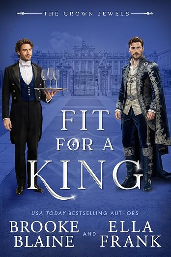
‘In Passion and Blood’ has the hottest guy in the background.
*
You’ve out done yourself with this collection, Wave.
OMG, it’s Candy Cane Guy with blonde hair in the background on that one.
Hi John
MaryM came up with many of the scariest covers, as usual. That woman rocks. 🙂
I would go for the Cannibals.
Drawing Closer… the story of an artist and his amputee model.
Man to Man… the story of conjoined twins who love the beach.
The Legacy… hmm, cats and women, nobody ever used them to suggest evilness before! Either that or it’s a good cover for a sequel to The Thing.
22… OMG! It’s disgusting! I may heave! He’s got an outie!
Lionsbane… Man? Woman? Store window dummy?
F*ck – the story of a man who tried just too hard to win a Darwin Award
Cannibals of Candyland – just when I was over my clown phobia…
Number 12 – She’s coming from the 1980s to screw you. Again.
Bad Boys Over Easy – Cover by I M Literal.
Cover artist of number 8 – do you need some more therapy to discuss that time you caught your parents doing it?
Blazing Embers just makes me want to call the police.
Number 1 Warrior wolf woman of the wasteland is pissed! The enemy attack right when she’s in the middle off shaving and then she couldn’t find her shirt. And what jerk ordered those goggles? Clearly not someone with pointy ears. Idiots.
~
Okay, enough snark – for now anyway. Some of the others are too disturbing to even get my head around. I’m torn between Super Fetus and Cannibals of Candyland… I think Cannibals clinches it though.
~
And who is this Carlton Mellick III? Aside from the unluckiest writer ever with covers?
JFM: Carlton was the winner of our last cover competition with the illustrious Satan Burger. In doing my research he is something of a … hmmm, I can’t think of the word they used but he’s supposed to be this new edgy “out there” type of writer. In other words you either think he’s brilliant (because you can’t understand a thing he wrote) or you think he’s a pretentious shit full of crap.
WTF! 21 / 15 / 8 / 3 / 11 I don’t know if I can chose one between them. They say don’t judge a book by it’s cover, those covers would not convince me to check out what’s inside. And Menstruating mall… Satan burger not titles that inspire me. But it’s just my opinion.
I actually read about Carlton Mellick III after he won the last cover contest. He’s a prolific author in the genre of bizarro fiction. I think he designs many of his own covers. I am not a fan.
–
A few comments on the others…
Drawing Closer: “Today’s direct observation portfolio drawing will be a torso…”
Kriss: that’s the most feminine man I’ve seen in awhile…I wonder what exactly is under that strategically placed flower?
Man to Man: more torsos
The Legacy: did that cat grow up to be the Impossible Princess?
F*ck: visual proof that Furries are not my kink.
Redline Lover: what is that thing that is turning the hot guy in the background into a torso? Some sort of laser human cutting device?
Soul Searchers: I hate those vacant eyes. Maybe colored contacts would help.
Super Fetus: do they offer anger management classes for babies?
Burning Embers: the guy on the right needs a waxing, stat! Is the stuff on the floor the hair from the guy on the left? Are those little candles the burning embers? What could this story possibly be about, anyway?
–
They’re all really bad but I think I am voting for F*ck, only because that guy had to put that outfit on and pose for that photograph. Something about the fact that it is real elevates it to a higher level of awfulness.
–
L
My vote is for Super Fetus. There are so many things wrong on so many levels; title, picture.
3, 8, 15, 23 and Cannibals are all hideous!!
*
I can’t quite decide which is the ugliest.
*
The Baby Jesus Buttplug and The Menstruating Mall have the worst titles.
Lily
Tam needs to know your #1 choice so that she can tabulate the votes and come up with a winner. 🙂
They are ALL ugly, but 8 & 3 are disgusting.
~
Gawd, now I know the exact meaning of: What has been seen cannot be unseen. *goes to search for some man porn*
I have to say Lionsbane gets my vote. I couldn’t figure out why she had a thing around her lower stomach. Then I realized they were her boobs.
O_o Wow. So hard to choose, but I think that I have to go with Cannibals. Eww.
I find the In Passion and Blood and the Menstruating Mall the most hideous. I kinda like the Baby Jesus Butt Plug, but then, I do own Butthole Surfers albums so my humor kinda swings that way ….
Some of the rest of them aren’t bad necessarily, they are just in poor taste!
Yvette
You don’t find these bad? Just in poor taste? 🙂 Did you say you have an album by Butthole Surfers? Is that music or porn. 🙂
*
I need you to vote for your #1 choice.
OH MY GOD.
–
I feel ill and I need to go and lie down. I’ll get drunk and look again later when I have a buffer of a bottle of wine against the horror.
Hi Erastes
I’m sorry to spoil your Sunday. The hard part is these are actual covers and I have enough for another post – they didn’t make it because they weren’t ugly enough. 🙂 You have to vote because Tam needs to know who will be the winner in the competition.
You are going to post, though? Sort of a repecharge?
I thought nothing could be worse than Legacy and Welcome to Mundania, and then I scroll down and see Cannibals of Candyland. OMG! And it only got worse after that….
I have a difficulty choosing, my vote goes to 8, 7 or the Cannibals…
Cannibals it is.
Now have to figure out how this can be unseen. Maybe some Lolcats or some nice looking men could help.
Elinara
Sorry, but Legacy is a pussycat compared to the fetus. 🙂
Maybe some mood music will help you get over the shock.
Scariest cover: The Cannibals of Candyland. Seriously, that thing is a nightmare waiting to happen. It takes evil clowns to a whole new level.
*
Worst title: The Menstruating Mall and The Baby Jesus Butt Plug. Both are hideous concepts and hideous covers.
*
Though if I must choose, I’d go with The Menstruating Mall, as the idea of a shopping center that bleeds vaginally makes no SENSE. I can, however, picture someone being perverse enough to own a butt plug shaped like the baby Jesus, because people really can be that weird.
*
Creepiest Cover: The Baby Jesus Butt Plug. This is chiefly because it’s giving me flashbacks to the Doctor Who episodes “The Empty Child” and “The Doctor Dances.” Seriously, I can almost hear that thing on the cover saying, “Are you my mummy?”
*
The ‘Eyeless in Gaza’ Awards: In Passion and Blood, Soul Searchers and Dangerous Liaison.
*
The Bad Photoshop Award: Man to Man, Ultra Fuckers and Bad Boys Over Easy. If I must choose, I pick Ultra Fuckers for the rooster comb made of penises.
*
The ‘WTF POLAR BEAR’ Award: Lionsbane has the most surreal anatomy in this category. Super Fetus has the worst title and the worst concept for cover design; the “fetus” looks like a grouchy sixty-year-old posing like Superman in mid-flight. F*ck, however, wins for having a guy who looks like Bruce Willis in a bunny suit screwing a tree. That redefines weirdness.
*
The Chick With a Dick Award: Kriss. The only way you can tell that’s a guy is by looking at the boob-less chest.
*
The Frightening Even The Furries Award: The nominees are–F*ck, Alpha, Impossible Princess, Sausagey Santa, and Warrior Wild Women of the Wasteland. Alpha and Impossible Princess are the worst drawn of this lot; Warrior Wild Women is the creepiest, possibly because the woman has the black nose of a dog.
*
Worst Cover Overall: The Cannibals of Candyland. There’s no question of that.
Tracy
Excellent summary. You obviously put a lot of thought into this. This is the 4th time I’m doing this and I still can’t believe that authors have these covers on their books. Are they nuts????
I’d have to go with Cannibals of Candyland.
Val
I think the Cannibals of Candyland is winning so far. 🙁
Oh and I kind of liked the rabbit suit guy screwing a tree. Whimsical I say. 🙂
Tam
The rabbit guy screwing a tree reminded me of a DSP cover I saw recently, which is surprising because they have some of the best covers. 🙂
I vote for the Super Fetus. Gives me the dry heaves.
But the others are beauts, too, each for itself.
Really, who’d buy that s…tuff?
**roaring in laughter and pounding fist on desk, nearly giving the cat a heart attack** OMFG THIS IS SO FUCKING AWESOME !!!!!! :-DDDDD I have to scroll up again so I can laugh some more. I’ll vote later when I can start thinking again 😀
What!!! You never saw some of these before???? You should be ashamed of yourself. You need to vote.
Oh, and somebody alert PETA, please. That poor bird on Baby Jesus Butt Plug and the beheaded kitten on The Legacy –
and who can be so cruel and stuff that lioness “Impossible Princess” in a Tiger Tank (top)…
Feliz
You need to vote for the most horrible cover. This is hard work to pick the winner.
I did above; I voted for The Super Fetus. Cover #3 ist the most horrible of all.
MaryM does indeed rock! Some of these are real gems. No, truly — they’re so bad they’re campy good. And the titles . . . Wave, you need to have a title competition, too.
*
Anyway, I’ll pick Blazing Embers (#11), because it was the most amateurish and least entertaining. I figure tasteless and/or inept graphics can be somewhat redeemed by their ability to provoke either shock or laughter.
KZ
Isn’t MaryM wonderful? She nominated about half of the covers. I think she has a store that churns them out. Many other readers also sent in their nominations which were just as fugly.
*
I think you’re right – I need to have a title competition. Next time. 🙂
All of these covers are so wondrously wrong on so many levels. The kitty-squid effect of “The Legacy” is horrifying, but almost calm compared to the visual mayhem of the “Mundania” cover. Overall, the Super Fetus is the top (bottom) choice, but I say that because Carlton Mellick should be given a lifetime achievement award and all his covers taken out of further consideration. His titles and covers are a class apart.
Hi PD
I love Carlton Mellick’s covers. Don’t you? 🙂
I think all of the entrants are wonderful (and I’m saying this without poking my eyes out). 🙂
I can actually give you some background on the Mundania cover as Kris posted it and someone associated with the book commented. It seems the cover is not really related to the story, but the cover picture relates to a specific podcast which I think is about sci-fi/fantasy stuff. The book was somehow associated with the podcast and they didn’t have time and/or money (I forget) to get a new cover so they used the podcast picture so their podcast followers would put two and two together. Not that bad of an idea but the font just blew it out of the water.
Baby Jesus Butt Plug!! But seriously, these are all WTF-ish that I just can’t pick one.
*walks around stumbling because of being blind by fugly covers*
KB
Are the covers getting better or worse? That’s what I want to know. BTW you need to vote. 🙂
Oh the humanity. If the covers don’t kill you, the titles will.
*
10 – F*CK – if this was a movie poster for a dark comedy I’d accept it. To me it’s not ugly, just awkward and not appropriate.
*
Cannibals of Candyland – It’s freaky, it’s creepy, but not all that ugly to me. The woman is in proportion, well drawn and colored, and she accurately represents the concept of crazy sweet slaughter. But I’d never touch it.
*
24 – The Legacy – Grotesque. If this was my book I’d find the cover artist and have him attacked by rabid Chinchillas. Or I’d sue the publisher that approved the art.
*
21 – Baby Jesus Butt Plug – Grotesque and ugly, however most of the disgust comes from the title and not the picture itself. If it were titled “When the Sky Fell on Canaries: a Fairy Tale” I’d take it for a depressing look at post apocalyptic birds.
*
8 – Menstruating Mall – Makes me want to gag. No excuse for this one, it’s ugly, title, picture and all.
*
THE WINNER – 3 – Super Fetus – What. The. Hell? *runs away to wash the sight from her mind with yaoi artbooks.*
Kim
I’m wondering why everyone is trying to poke their eyes out. 🙂 I thought that some of the covers were quite lovely. Thanks for the vote.
Lionsbane is a personal favorite of mine. I pick that one. Something about her hair just screams out to me.
I vote for the soul searching zombie.
Cover nr.4
I see that this “ugly covers” competition doubles (in far too many cases) as a “horrible title” competition. 😉
–
BTW, I thought Drawing Closer‘s cover was okay, but the rest were varying degrees of atrocious, fer shure.
Kendall
K.Z. suggested that we should have a “worst title” competition as well. Maybe next time.
Are we allowed to vote for our own cover?
Of course Stephani and if you win I’ll make you a little award for your blog/web site. 🙂
Ack, I don’t think I can look at those again in order to choose. UGHHHH
Shawn
You can’t peek and go. You must vote! How do you expect Tam to do her job as judge? 🙂
Thanks Tam! I’ve always wanted to win something. Not that I think I have a chance to beat that one with the guy making sweet love to the tree.
Stephani
You can vote to increase your chances but I think the competition is much tougher than when A.J. won. 🙂
Bummer! Thwarted once again!
#7-HUH? What the he!! is that?
#8 and #3-Just can’t choose between them.
What is so bad about the cover for Redline Lover(#5)? I like a good chest.
Beth
Redline Lover was nominated by several readers. Obviously this cover struck a nerve.
*
Do you think you could narrow your choice down and vote for one cover that you think gets the whole ball of wax? 🙂
Drawing Closer—featuring Johnny Eck!
Kriss—The “More Femme than the Author” award.
Man to Man—mirror-biased photoshopped calf-humping! Then again, with those pecs, it could be (man)titty-fucking.
The Legacy—I always meant to read that one.
Welcome to Mundania—this wins the “Blind your Best Horse” Award for bad color.
In passion and Blood—not bad. The photoshopper needs to work on the lighting angle.
The Baby Jesus Butt plug—blech. It would be a good cover for a steampunk piece, but the title is awful
Lion’s Bane—Winner of both the “Androgyny is Fun” and the “Needs a Remedial Anatomy Course” awards.
F*ck—F*ck, I’d read that! “How a liaison with a knothole produced a son of a beech.”
Alpha—meh. Not bad, not grabbing me
Bedeviled—I’m taking up a collection to get the artist more than one crayon
Cannibals of Candyland—That one is awesome. I would totally read it just based on the cover.
Screwed again—that looks like a sexy vamp novel. Not bad
Ultra-fuckers—OMGWTFBBQ? Buttplug mohawk.
Bad Boys over easy—meh
Menstruating Mall—The goggles. They do nothing!
Impossible Princess—Remedial Photoshop class time
Sausagey Santa—That’s great in a very cartoon way. I would read it based on the cover.
Redline lover—bleh
Soul Searchers—The new zombie craze? They eat your soul instead?
Super Fetus—Dear Gods make it stop.
Blazing Embers—bleh.
Warrior Wolf Women of the Wasteland—hooo-kay So long as it’s not written in Old English Meter as well
Dangerous Liasion—bleh. Typical anime cover
~
~
It’s gotta be The Menstruating Mall. That is just horrible.
Aggh! I definitely need that “Unseen” button to click so I can scrub all that out of my brain!
“Winner”–Cannibals. I hate to just go with the crowd, but someone had to actually work on that image and typeface… and spending any time at all on it is just ridiculous.
Dishonorable Mentions:
No. 28–“Drawing Closer” is just disturbing because we’re meant to notice the execution of the drawing, which is just execrable as well and excruciating!
No. 25–Nice tuck under that puny flower, otherwise it’s just kinda weird.
No. 24– A flash-back to the ’70s.
No. 2 –Dangerous Liaison — “Hey, my little cousin will do you a cover for free! He’s teh best anime artist EVAR!!!”
Worst titles: baby jesus (trying too hard to shock–oh the horror …yawn…) and menstruating mall. ugh.
WTF??? titles and covers: super fetus and blazing embers–???!!!
Thanks April. I think you captured the spirit of the competition. 🙂 K.Z. suggested that I have a “name” contest since so many of these are so bad – maybe next time. Love your comments on the nominees. Maybe you will submit nominations for the 5th Ugly Covers Competition!!!
Okay, okay, I gotta go with the candyland one then. I admit I gasped when I saw that one for the first time.
Thanks for the vote Shawn.
*
On another note, why haven’t I seen any recent releases from you? Are you with a new pub.?
Nah, just slowing down. Only in His Dreams comes out in March from Amber Allure.
I actually like No. 16. Some of these are so bad I was afraid to take a second look.
*
I choose No. 8 (had to look a 3rd time too, oh yucks.. now I have to go hug my kids and go lay down).
Salina
I’m very sorry I’m making hyou and everyone else ill – well, not that sorry. 🙂 Just hug a kid or dog to make you feel better.
Okay, I’m totally ready to duck rotten fruit here, and maybe it’s just my ‘puter or connection or something, but as far as I can tell…
* *
There’s no #s 9, 14, 17, 18, 20 or 27. There are TWO # 19s and the cannibal candyland cover has no number assigned.
* *
I’m just wondering whether there are supposed to be covers in the post for the missing numbers before I cast a vote. *hee*
* *
Sorry, don’t mean to be a pain in the arse. 🙁
*
~Tis
TC
I had a problem with the post. My 24 inch monitor is in the shop and I have a loaner that’s 15 inches so I couldn’t see anything, plus the computer screwed up. Eventually I had to start over and even had to ask Christian for help because the post would not format. Long story short, what’s there is what you get and what you vote for. If there’s no number just use the title of the book – they are all awful.:)
Well, that makes sense, then. 🙂 I just wanted to be sure I wasn’t missing anything.
* *
So, for sheer wtf-ery, I’m gonna have to vote for Menstruating Mall. Seriously, that’s a cover I would literally run from. There’s nothing even remotely appealing about it. *shudders*
* *
Coming in a close second for me is Lionsbane, with Super Fetus in a tight race but taking third.
* *
The cover for F*ck actually amuses me, mostly because of the look on the poor guy’s face. You can just tell he accidentally found a squirrel or chipmunk that took his home invasion poorly. *hee*
*
~Tis
EEEEEEEEEEEWWWWWWWWWWWW!!!!!!!!!!
now you went and gave me nightmares. Yuck! make it stop! hated too many to choose and refuse to look again. You can’t make me!
Diane
I hope you’ll reconsider and VOTE. You can wear dark glasses !! Please vote so that Tam can figure out the winner (or loser). 🙂
Stop being such a wimp Diane. Look again. You live in New York for cripes sakes. You’ve seen it all by now I’m sure. 😛
Wow. Seriously…how do you pick just one of these?! In fact, I can’t. The best I can do is narrow it down to the top three (or should I say bottom of the barrel three!) which are all tied as seriously creepy for me. Those would be The Cannibals of Candyland, Super Fetus, and The Menstruating Mall.
–
And I’m not even going to *touch* some of these titles. Shudder.
Hi Ml
Thanks for the votes – I really appreciate them because it’s hard to pick a winner in this bunch. Poor Tam whose job it is to figure out who wears the crown this time.
*
I’m seriously considering a “title” contest because some of these are really awful. If I get enough nominees maybe I will. 🙂
I actually like some of the covers, although some of them belong on Badly Photoshopped Photos or whatever that blog is.
*
The TITLES, however, are scary as fuck! What the hell? And just in case I ever thought I was going to change my mind on being pregnant, that fetus thing definitely ruined it. (No. No pregnancies. Ever.)
*
The Candyland book is terrifying, but the art is actually technically not that bad, so I just can’t in good conscience vote for it.
*
For pure bad quality, it has to be Impossible Princess. Not just the bad photoshopping and questionable taste, but the overall quality of the cover, the way everything blends into itself and … Sorry, bet you didn’t know I was an art history specialist at one point. 😉
*
Anyway, next you should have a Bad Titles competition. And I’ll just cross my fingers that none of mine end up there. *grins*
Jules
Thanks for your vote. Every one counts. K.Z. Snow suggested that next I should run an Ugly Book Title competition and it’s looking more and more as a possibility. 🙂 I’ll check out the names of some of your books to ensure that they get the appropriate recognition.
I actually kinda like the Candyland cover, disturbing, right on 😀
Some of the covers are just bad and amateurish, I agree with Jules – it’s the titles that are scary.
I’ll have to go with Lionsbane. Erotica with Frankensteins butler Igor licking a comatose drag queen, or is it a blow-up drag queen doll?
Hi Kady
I kinda like Lionsbane myself but I’m leaning toward Super Fetus. what a horrible cover! 🙂
Well, if I have to pick just one it would have to be #8. Don’t even want to think about that one.
While the covers (and titles) of the books from Eraserhead Press are a little out there, the guys from the small press are real keepers.
Met them in Portland Oregon at OryCon and found them to be a bunch of polite, fun-loving, and the most hysterically funny people I’ve ever met.
I bought three of their books just to support the pure awesomeness of the encounter.
Hi RD
>>While the covers (and titles) of the books from Eraserhead Press are a little out there, the guys from the small press are real keepers.<< I'm sure that you're right, but you have to admit that their book covers are something else. 🙂 * You didn't vote. 🙂
They /are/ something else which makes me love them a little bit. 🙂
And D’oh. I was hoping you’d not noticed that part. 😉
My ticky mark goes beside Lionsbane.
OMG I’m laughing so hard I have tears streaming down my face. It’s a tough choice but if I have to pick just one, my vote goes to Baby Jesus Buttplug with Redline Love and Blazing Embers close behind. Is that stubble they’re standing on in Blazing Embers?
Sydney
>>Is that stubble they’re standing on in Blazing Embers?<< I think it is. What else can it be? 🙂 * I'll make sure that Tam our high priestess of the votes, counts yours. * I'm so happy that we brought a little fun into your life. 🙂
Please excuse me while I go bleach my eyes! And seriously, some of these also have the worst titles I have ever read…….if I could vote for them all I would, but my vote goes with The Baby Jesus Butt Plug….for kinda obvious reasons…what IS that alien-like head with the gas mask all about? Scary. It also gets my vote for hecka bad title too!
Elaine
Baby Jesus thanks you. 🙂 A bottle of bleach is on its way to your home.
Uhm… ewwww… the one that’s going to make me lose the most sleep is ‘The Menstruating Mall’ but really? They all lovingly caressed my gag reflex. Where’s the eyeball bleach and cortex rinse when you need it?
Amy
Is that a vote for the Menstruating Mall? I don’t think there was that much wrong with the cover! 🙂
OMG, Wave, you have outdone yourself. They’re all so awful that I honestly have a hard time narrowing it down to one. However, Super Fetus is just downright disgusting so #3 gets my vote if I have to vote for only one. Honorable mentions go to: 15 and 8. 24, 10 and 21 are just wierd. I liked the guy on #5, but the guy on #22 — just yummy.
Jen
The applause should go to the readers who submitted nominations. I could never have found these beauties. Tam is the judge and she will make a note, I’m sure, of your vote for the Super Fetus of the year. 🙂
Your Honourable Mentions are just as lovely.
Jesus, these are UGLY. Though I think the first 3 are just kind of dumb. The rest… it’s a tie.
Hm… Okay, I’ve got it. This is an anti-piracy ploy, right?
A nice selection once again *sigh*
At least the candyland has some humour going. I am voting for menstruating mall. with lionsbane a close second
Ingrid
Yours is the last vote because I’m closing the voting now so that Tam can do her thing. Hail to the new champ!